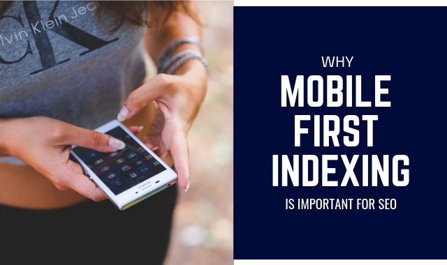
Google always attempts to make things simpler and easier for its users. In its interest to make the online world more mobile-friendly, it has introduced its novel approach – Mobile First Indexing!
The announcement for it was made in March 2017. But despite that, not every business owner has a clear idea on what exactly it means, how it works, what it is good for, how it can be used, and more. If you too have any confusion regarding this topic and searching long for a correct answer to all your queries, then reading this post will really benefit you.
In this post, I’ll explain everything about mobile-indexing in a systematic way.
Let’s begin!
What is the Meaning of Mobile First Indexing?
Just as you would guess from its name, mobile first indexing is all about the mobile version of your site. With this approach, Google will index and rank your site based on how it functions in its mobile version. If the mobile version of your website receives an increased level of traffic then based on this approach, your site can receive higher rankings on Google search engine rankings page.
Remember, this approach is ‘mobile first’ and not ‘mobile only.’ For example, if you don’t have a mobile version of your website, still you can include it in the index. However, this means that your site is not able to deliver a mobile-friendly experience to the users and hence it could negatively impact your website’s rankings. This way, a site offering a rich mobile experience would earn higher rankings even for desktop searches.
The benefit of this approach can mainly be attained by websites available in both desktop and mobile version. If the desktop and mobile versions of your site are equally optimized for user’s behavior then this will have a significant impact on search result performance for your site.
Google is always focused on prioritizing indexation and crawling of your site. While earlier, the desktop version of a site was considered primary and the mobile version was deemed as an alternate one, now, it won’t be the case. With its mobile first indexing approach, Google is directly encouraging webmasters to focus on the behavior of their mobile customers and to design their sites accordingly.
Google’s Verdict on Mobile First Indexing:
Before you get panic about the situation, know what exactly Google says about its mobile first indexing approach.
Google has already staunched the panic around its mobile-first indexing approach. It has clearly announced that the approach will not impact your website’s rankings, at least in the short-term.
Most importantly, Google will now use a bot known as ‘smartphone agent’ in order to identify sites that follow best practices related to mobile use. Hence, users have to focus on a suitable use of the website for mobile users.
So, here is everything you need to know!
Will Mobile-First Index Affect Your Website’s Ranking Now?
In 2017, Google took a sample of websites in order to experiment with this approach. But over time, the number of websites being analyzed has greatly increased. Though it may not affect your website ranking right now, it will be going to do this soon.
Hence, don’t wait for a timeline and start working on creating and optimizing the mobile version of your site.
Will only the mobile version of your site be used to determine the rankings?
For a mobile-first indexing approach, only the mobile version of your site will be considered the primary source to determine the rankings. But for those who don’t have a mobile version, they can use their site’s desktop version as of now.
Here, you have to work on improving your site’s ranking based on the mobile version and at the same time track the performance of desktop-version of your site.
What will happen if you don’t have a mobile version of your website?
If you are among those who still don’t have a mobile version of their website and even your desktop version is not mobile-friendly then the good thing is that still, your content can be indexed. But at the same time, you may not get as good rankings as your competitors with a mobile-friendly site.
For this reason, it can negatively impact your overall site rankings on desktop search results too.
Will it create any impact on the ranking factors?
According to the experts, yes! This approach will impact a range of ranking factors as well as the future strategy of your site. It is because the experts are considering it as an indication that Google will now focus more on other aspects of your website rather than relying on URL for organizing content.
Ways to Boost Your Website Rankings with Mobile First Indexing Approach:
It’s obvious that mobile-first indexing favors content that is mobile-friendly. But it involves more than this.
Google cares that its users must be able to find all pieces of content on a site’s page, able to read the text without scrolling or zoom, and conveniently interact with buttons on a page.
In this context, a mobile-friendly website must have the following traits:
- Easy to use on a mobile setup
- Responsive design means that the design must change in accordance with the screen size
- Good loading speed
- Excellent Interstitials
It is essential for a mobile-friendly site to have a responsive design. If your website has a responsive design then it will definitely do well online.
Depending on your website’s present state, you may have to design an entirely new site from scratch, or simply you can make certain changes to the existing design of your site.
Here’s a checklist of everything you need to do in order to create a website that meets the guidelines of the mobile first indexing approach.
Make a Responsive Design for Your Mobile Site:
This is of utmost importance, especially if you want to rank your site higher in the search engines. A great thing about responsive sites is that they rank well on the mobile platform as well as a desktop platform because their design adjusts well to the screen size.
In addition to this, websites with responsive design offer people a rich desktop as well as mobile experience. And this is a major reason why Google suggests including a responsive design for each site.
Presently, most of the world has become mobile. Hence, it is essential that you consider offering a rich experience to your users on all the platforms.
Optimize Your Site’s Content for Mobile Platform:
One of the major mistakes marketers make to create mobile-friendly sites is to disable some content on the mobile version. Actually, you must avoid doing it!
Mobile users are even in a more hurry to get access to complete information as compared to desktop users. They are more willing to look at images, texts, videos, and other media at a fast pace. Hence, don’t remove them from your site in order to boost your website’s loading speed.
Rather than this, it is better to optimize your site’s content for mobile users. The content on your website must be able to meet the demand of every searcher. For this, you must research in-depth on a specific subject, optimize Metadata, as well as use appropriate media to illustrate the points.
The quality, as well as quantity of content on your site, must be at par. Even a small mobile phone is big enough to read the entire article. Hence, the content of your site must serve all sorts of users.
Add Media and XML Sitemaps:
With XML and HTML sitemaps, it is possible to easily tell Google when new content is published on your site. As a result, they can help the newly updated web pages to get indexed faster.
There is not much difference between XML sitemaps and media sitemaps. The only thing is media sitemaps include media like videos and images other than text. There are numerous sites that prefer media sitemap and Google is able to index those pages as well.
For WordPress users, the simplest way to create a media and XML sitemap is by installing Yoast Plugin. It automatically generates sitemaps, and hence, you don’t have to worry about codes and other essential details.
Establish Structured Data:
Further, you must include the same structured data markup on your desktop as well as mobile versions of the website. URLs displayed in structured data must be similar to the mobile version of the URL.
This kind of data is also known as schema markup and it gives a clear explanation to Google regarding what is contained in your site. For example, structured data can be used on a recipe page to show the cooking time, ingredients required, and more.
There are tons of schema markups available. You can always select schema markup based on your preference and apply them to help search engines users to find your content conveniently. Make sure you add schema markup that is relevant to the content on your website.
Optimize Meta Data:
Another way to enhance your website for mobile-first indexing is to optimize metadata. It is a way to communicate with search engines as well as online users. There are distinct sorts of metadata available and you have to optimize the correct ones.
Make sure your meta descriptions and titles match desktop and mobile version of your site. It is because these two are primary sources of data that a researcher views when they land on Google SERP.
Whether a user sees the mobile version of the site or desktop version of the site, he must be able to view the same thing.
Most importantly, the images too must be the same. Hence, every image of your site must have an alt attribute.
Enhance Your Website’s UX:
The best way to do it is by first visiting your site on a mobile device pretending yourself as a customer. Visit multiple pages and try using the search feature. Also, tap text and navigation icons.
If you identify any issue, just note it. Once you have noted everything, your next task is to rectify all such issues in order to enhance the overall user experience of your site for mobile visitors.
Optimize Loading Speed of the Website:
No matter which device users use, it is important that your website has fast loading speed. When people are searching from mobile, most probably they are in a hurry. Hence, they are searching for the best answer to their question in the shortest time frame.
If their need is urgent, they will not wait for your slow loading site. It is therefore essential to work on improving your website’s loading speed. The PageSpeed Insights tool from Google lets you know how well your site loads on mobile and desktop. You just have to enter the URL and the results will be displayed.
Include AMP or Accelerated Mobile Pages:
Accelerated mobile pages serve a route to make your website more accessible to mobile users. Hence, it is important to set up such pages for the mobile version of your website.
If you don’t know how to do this, then you can use WordPress AMP Plugin. This plugin lets you create AMP pages easily.
AMP pages and non-AMP pages are handled differently by Google. For websites with AMP as well as Non-Amp versions, Google indexes the mobile-friendly version. It implies that Google will also be using non-AMP URLs in SERPs.
Prepare a Mobile-First Strategy:
Finally, you need to prepare a mobile-first strategy for your website. This does not mean that you first have to prepare everything for the desktop version and then shift it to mobile. Rather, create everything in line with the mobile environment. Think about what looks good on mobile and what not.
Conclusion:
The mobile-first indexing approach is nothing to get panic about. Only you have to keep certain aspects of consideration and design a rich mobile version of your site. If you do it precisely, then there will be little impact of this approach on your site.
Just evaluate the mobile version of your site and ensure that you deliver only the best to your mobile visitors.