The main chore of any website designer is to choose the appropriate color pattern. When any website is considered, choosing the right color may not be a tough task but it needs patience and time. It is believed that there is a psychological effect in the color that is being used.
For example-vibrant colors are red and colors like blue associates to peace and calmness. As the user enters the site, usage of cool colors makes them feel comfortable. Dynamic and young individuals would love to look for bright colors.
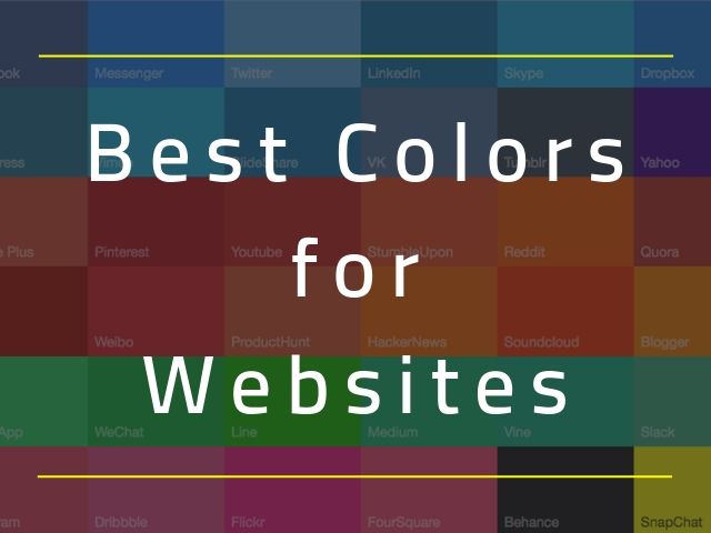
Color scheme evaluation is the main parameter and an experienced website designer is well aware of it. They choose the colors based on the brand and the meaning for each color. Lets glimpse through the various color palettes utilized by famed websites. Here are a few real site colors and few color codes for your reference.
Best Colors for Websites that Convert:
1. Soothing Tones:
Soothing tones are definitely trending presently. Creation Namale is a Canadian jewelry brand and the color used by Creation Namale is very appealing, soft and classy. It’s the first choice for a brand in the jewelry selling fashion industry. You can make a note that the website has limited text and they do not jam pack numerous products in a single page. They follow just one per period as the procedure and that is the reason why the website is famed for.
The direct color code is mentioned below for ones who desire to make use of the mentioned colors.
- #C5D5CB (greyish cyan)
- #9FA8A3 (dark greyish cyan)
- #E3E0CF (grayish cyan)
If the design in the website employed multiple colors, the trend, and simplicity the website would have vanished.
2. Jet black with soft pink, bright pink:
Pink is usually considered as a color for females, but this site has changed that thinking for pink. Cowboy brand is familiar with trading electric bikes but the highlight is that the website is pink in color. Pink color doesn’t go with the word cowboy But the outstanding aspect is that the website has a trendy as well as glossy design.
The promising part is that when jet black bikes stand in front of pink backgrounds, it grasps others attention. When additional bright pink is added to the scenario, they are added to the latest style and color palette. The product is unisex and a perfect example to change the usual thought or saying and pick the best color palette for your website. For ones who desire to stick to the latest style and color palette, can opt for the given color codes.
- #000000(black)
- #FA255E (soft pink)
- #F8E5E5 (bright pink)
3. A deep navy, grey and striking yellow:
Are you looking for professional colors but ones that aren’t monotonous or outdated?
The Avondale Type Co. must be monitored for its color scheme used. The amalgamation of deep navy, grey, as well as outstanding yellow shades together with modern, flat and sharp layout, can offer with a brand new look and feel.
- #C5C1C0 (screen)
- #0A1612 (steel)
- #1A2930 (denim)
- #F7CE3E (marigold)
4. Black, white and yellow:
The latest color palette for this year can be viewed in Igor with distinguishing yellow, white and black colors. This color palette, although seen in varying shades, is widely in demand. This combination is probably one of the most striking.
- #000000 (black)
- #FEFEFE (white)
- #FDEE30 (yellow)
5. Colorful scheme with dark background:
Typical two- or three-color palette is very common. Prevent Epidemics makes use of vibrant color pattern partnered with backgrounds that are dark. They also make use of the user interface that represents green. The latest style in opting for colors is to pick color sets that are extensive.
- #292930 (black)
- #3EB650 (green)
- #FCC133 (yellow)
- #E12B38 (red)
6. Black background with Blue and yellow:
One of the best combinations of blue and yellow you’ll find at Loic Sciampagna’s portfolio. The distinct shades are simple, dignified and engaging with the simple touch of the light, brighter blue.
- #141824(black)
- #FFB600 (yellow)
- #0049FF (blue)
7. The Bright combination of orange and black:
Tappezzeria Novecento uses this color scheme. It gives a pleasant and cool feel when black and orange colors are employed. The other beneficial aspect is that the colors make it easy to read. Since the brand colors are found in images, it really looks great and cool.
- #191919 (black)
- #FAB162 (orange)
8. Soft pink with purple:
Soft shades are the main source for Niche & Cult for beauty products that offer a feministic feel. The main color parameter for beauty is soft pink and makeup is tied with blank. Moreover, the site is offered a unique effect with bright purple.
- #4E3883 (purple)
- #FFDDCC (soft pink)
9. Tints and tones:
When one color of different hue is added, your palette would have a diverse facet. Vincent Freman’s website represents a stylish look as he employed different tints of peach color. This was ultimate as it complemented purple color.
- #94618E (grape)
- #49724A (eggplant)
- #F4DECB (sand)
- #F8EE7 (shell)
10. Clean gradients and fresh blue:
Taking a deep look at any website would have made you think to have it neat and clean. Possessing a clean website is important. To implement such clean websites, gradients are employed as in Shibui website. The highlighted aspect of the website is that they make use of turquoise and blue shades that are amalgamated with each other. This is the main smart idea that offers a fresh and clean feel for the site.
- #77C9D4 (feather)
- #57BC90 (marine)
- #015249 (flower)
- #A5A5AF (sleek grey)
11. Purple with green (unexpected):
Take a look at Intesys S.r.l. Website, they show the effect of mixing green with purple by breaking the usual saying that they should not be mixed. The site uses the rich purple shade that looks completely contrast against the sharp whites and lime. This makes the site vibrant as well as unique.
- #6E3667 (violet)
- #88D317(electric lime)
- #1A0315 (deep plum)
- #535353(shadow)
12. Simply black and white:
Almost everyone loves the color combination of black and white and a perfect example for that would be Lucia Lash. This website utilizes only black and white for popularization as well as minimization.
- #FFFFFF (white)
- #0A0A0A (Black)
13. Rich jewel tones:
The gorgeous jewel tone loved by all was designed by Nordic Ruby. This website has picked advanced colors for the color palette of the site which has made a promising design.
- #BC4123 (strong red)
- #0B172A (very dark blue)
- #463940 (greyish pink)
14. Primaries and cutting-edge pastels:
The Anton and Irene designed by New York professional designers is something to be looked at before discussing color palette. The outstanding aspect to be noted on this website is the ultramodern color outline. Anton and Irene have made the best selection of colors. The highlight of this site is that it has employed the usage of multiple colors but sparingly without messing the page.
These mentioned varied combinations can be employed to offer a futuristic feel and look for your website.
- #C2DDE6 (light greyish cyan)
- #431C5D (very dark violet)
- #E05915 (vivid orange)
- #CDD422 (strong yellow)
15. Grey, soft yellow and deep green:
The QED group is a website that provides individuals as well as organizations ideas to enhance the development of the organization. The site helps in the application of ideas in behavioral economics and psychology. The best part of QED Group is that they employed the latest and stylish colors on their website. The usual thought in individuals mind is that purple, green and yellow are colors that are tough to read over. The site has decided to make use of dull grey shades and light shades in the background. So hence in the midst, they are able to add bright contrasting colors.
- #DDFD4 (grey)
- #FAE596 (soft yellow)
- #3FB0AC (bright sea green)
- #173E43 (dark Greyish green)
16. Bright red balanced with muted tones;
Red is a powerful color that attracts all and needs proper care while employing on the website. Such colors can be the best choice to utilize in keywords. Red can also be paired with other subdued colors for a better look and feel. The very boldly bright red color is used in the major part of the website by creative branding agency five/four. Since the page employed the usage of muted tones, the website became familiar. Hence with red, a stylish look can be obtained.
- #FA292A (bright red)
- #B89F5D (DE saturated orange)
- #5A7670 (dark greyish cyan)
17. Jewel tone with bright colors:
Jewel tones along with bright shades are the style utilized by the site Day of the Dead. This actually offers a real feel for the site. It is important to have a balance in choosing color shades. This is because they develop contrast and makes other elements visible. Such high color environment isn’t very distracting.
- #32064A (darkest violet)
- #E56B1F (vivid orange)
- #FCD02C (bright yellow)
- #E42C6A (bright pink)
18. Mint green and peachy orange:
Peachy orange and mint green are the two main colors opted by Stereo super. They make a combination of the mentioned colors for an incompatible color palette. There is never an end for mismatched palettes as many bolder and brighter color options are available. When implemented these colors make it look unique.
- #FB9985 (peachy orange)
- #B3E3B5 (mint green)
- #48484A (greyish black)
19. Varying degrees of blue:
When website design is considered Jean-Baptiste Kaloya is considered as a familiar color in website design. The key reason for its familiarity is the wavering amounts of blues in a monotone palette. It also includes the soft gradient of blue.
- #150734 (navy blue)
- #0F2557 (darkest blue)
- #28559A (dark blue)
- #3778C2 (soothing blue)
- #4B9FE1 (light blue)
- #63BCE5 (light blue)
20. Bright yellow with black:
Pittori di Cinema has mentioned that any color though it’s more or less makes the scenario look true. The perfect choice is that they opted for black along with dark yellow. This was considered high color for them. It is true that when a palette includes bright colors for any pattern, it would look stylish.
- #FDD935 (bright yellow)
- #000000(black)
21. Muted palette with a gray-blue and gold combination:
Grey blue along with muted shades holding hands with gold has made Veneziano Coffee Roasters an elegant one. The images are outstanding with the opted color pattern and make it look unique.
- #F6F4F2 (light greyish orange)
- #425664(greyish blue)
- #C6AD8F (slightly DE saturated orange)
22. All bright but classy:
When contrast backgrounds are decided along with three colors green, blue and dark yellow does not seem to score. But FFWD Digital follows this pattern in a trendy way where they follow the contemporary style of bright shades.
- #F1E821 (vivid yellow)
- #487AFA (bright blue)
- #23C0AD (strong cyan)
23. Purple, blue and peach combination:
When taking a look at the greatest color outlines site list, you can find the building and construction commission website as well as the Australian government website too. The attention-grabbing aspect is the usage of blue, peach as well as purple in the sites that make it look striking.
- #9B3A95 (purple)
- #3D7DA7 (blue)
- #F4ABAA (peach)
24. Neutral and only one true color:
Another simple website with a cold color shade is Kyle Decker’s portfolio. Neutrals are the key element used here. Another highlighting aspect is that one true color is used to grab the visitor’s attention.
- #F5F5F5 (white)
- #8DB48E (greyish lime green)
- #4D724D (very dark greyish lime green)
Conclusion:
Bidding goodbye to the color patterns being used until now is a smart decision. Users must understand the fact that color schemes are the main factor that can influence the sales in a business hence more time is to be dedicated to website designing. Choosing the best colors for websites can be a stress-free way as there are adequate support and guides online. An online hunt can offer loads of ideas for the designer to go for the right color pattern.
For any particular brand, awesome dominant colors can be picked along with few complimentary colors. In order to maintain good aesthetics, there are tons of background colors to be employed.
The website color is significant as it aims the visitors as well as reveals the brand. The color palette should be selected in a manner that represents the idea. Colors should be picked in a manner it stands out of the rest in the competitive market.
The success, as well as the failure of a website, is decided by the color pattern employed in it. This should be well understood by designers before planning for colors for their site. Hence for website design, picking the appropriate color palette is important.