
The world is glued on to their smartphones these days. For us, we need everything on the go.
Switching on a laptop or PC every time we want to surf the internet is not really a convenient option, rather phones are little handier to do so.
Traditional websites designed for PC’s or laptops take forever to load on our phones because the images and all make the website heavy.
That is why more and more companies are making their websites mobile friendly so that users keep visiting their websites and the traffic does not fall down.
In this article, we are going to discuss all the websites being mobile friendly. But first, let us understand why they are important.
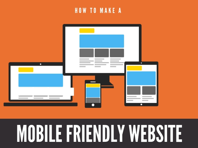
Why a Mobile Friendly Website Is Important?
Even till a few years ago, websites were not particularly meant for mobile use.
But that scene has changed drastically and now everybody is formatting their websites to make them mobile friendly. Let’ see why.
- Google gives more priority to mobile friendly websites. Since SEO and search engine page rankings are such an important part of the digital presence of a company, everything a company or a website does is to boost its page rankings.
Google changed its algorithm in 2015 and started prioritizing mobile friendly websites over traditional websites.
- Building a mobile friendly website adds to the company’s credibility. Irrespective of whether you are a B2B or a B2C business, your website is going to be your identity.
Finding prompt results on their mobile will add to your goodwill in the market. But make sure your mobile website loads on the phone properly.
If it does not load properly on the consumer’s phone, why would they choose you?
- The mobile-friendliness of a website affects the bounce rate and click back time of the website, both of which are continuously monitored by Google to determine a website’s ranking.
- A mobile friendly website gets you better traffic. Mobile data consumption has gone up tremendously high since 2016 and now over a quarter of the global population use their phones to surf the internet.
So that means tremendous traffic for your website too.
- Better traffic would obviously mean a higher conversion rate as well.
But make sure you make the ‘Call to Action’ or CTA quite clear in your mobile friendly website, as mobile users have no time or patience to browse through the entire website to find the CTA.
How To Determine If Your Website Is Mobile Friendly?
As the owner, there are few questions to ask yourself to determine if your website is mobile friendly.
Search for your own website on your phone and check the following:
- Is it taking more than 3 seconds to load on the phone? If yes, you need to work on it.
- Can you get the idea or the message of the website as soon as you open it?
- Is it easy to navigate to different sections and different web pages of the same website?
- Can you easily find the CTA?
And the most important question of all,
- If this was not your own website, would you have spent time navigating through it?
Building Your Mobile-Friendly Site
So, now that you know how making your website mobile friendly can boost your business, let us now focus on how you are going to make your website mobile friendly.
There are plenty of ways to do that, but you have to get the idea right of how a mobile website is different from a traditional website.
1. Make your mobile website as similar to the desktop version as possible:
Your users know how your desktop website looks like. When they are browsing for the website on their mobiles, they will be very confused if the mobile version is different in color, themes images from the desktop version.
So, the mobile version of the website should look like the actual website.
There are various online platforms that enable you to design a mobile friendly website from your original website, or you can always go back to your developer.
2. Take the help of popular content management systems or mobile plugins:
The content management system that your website works on, which is mostly WordPress, has its own methods that make your website mobile-friendly without making another new website for the mobile.
Not just WordPress, the different other content management systems also provide some additional ways in which you can modify the mobile version of your website.
As a result, your users can experience a customized version of the website on their mobiles with some exclusive features.
3. A lot of websites use the Mobile-first responsive design and you can too:
The previous two solutions are basically ways to make your website work smoothly on mobiles, as long as you do not completely optimize and redesign your website to run on mobiles. So, they are not a permanent solution.
The best way to make your website mobile friendly is to use a mobile-first strategy and make a responsive design.
But before you start designing your website with the mobile-first approach, you need to plan a lot of things and ask a few questions. You have to plan on what content will go on the mobile design of the website, what content users will find useless etc.
Such responsive designs make a customer’s experience quite satisfactory when they are browsing through your site. So, users keep coming back to your website.
When you use the tools that WordPress provides to optimize your website to mobile version, there are chances that the website might not then work properly on your PC or laptop because it has been optimized to work on the mobile.
When a website for the mobile version is responsive, the possibility that it won’t work on a PC or a laptop is eliminated.
The responsive design of the mobile-friendly website makes sure that your website fits into any screen size on any kind of device. It also ensures that your website works consistently on every kind of device.
How Does A Mobile Website Work And What Are The Key Differences From A Regular Website?
1. Responsive design:
Even though we have already covered this in the previous topic, let us discuss what it is.
When your website has a responsive design, it means that the website can automatically detect the size of any kind of device that it is being loaded on.
Once the website detects the size of the device, it automatically scales itself to fit in that screen.
So a user who is visiting your website can easily navigate through it without having to zoom in or zoom out on any portion. This makes the user experience better and they spend more time on your website.
But it actually depends on a company if it wants to use a mobile-only website since that accounts for maximum traffic, or does it want to use a responsive design, such that users can view the website on any kind of device.
2. Lesser Website Reloading Time:
This is actually the real challenge, to make sure that your website or any webpage on the site loads as quickly as possible on each kind of device that exists.
You have to understand that users do not really have time to wait for a website to load.
The usual waiting time is 3 seconds. If your website does not load on their mobile screens within that time, the user will leave the page and visit some other website which has a quicker loading time.
There are few ways to make the loading time of your website on mobile lesser. The one thing you can do is image optimization, where you reduce the size and pixel of the images to make sure that they load faster.
You can also streamline the HTML code and there are different other tasks you can do to optimize your website so that it loads on the mobile faster. These methods can be time-consuming but very effective.
You know that the ultimate motive of your website is to get higher page rankings on Google search results. Google continuously monitors your website and your competitors and give higher rankings to websites which load faster.
Not just that, as we have already discussed earlier, Google prioritizes mobile-friendly websites to determine your website’s ranking.
A lot of websites used the AMP or accelerated mobile pages code to reduce the loading time on mobiles.
AMP is a kind of coding language that Google uses to understand and improve your page rankings. But the AMP code is not the ultimate solution because it does not cover a lot of features and qualities that a mobile website should have.
Tips On Creating A Mobile Friendly Website:
By now, you know the importance of having a mobile website and also the ways to do that.
Here are a few tips that will come in handy while developing your website for mobile friendly version.
- Keep in mind that users should be able to navigate and surf your website using just one finger. They shouldn’t have to zoom in or zoom out every time they want to see something.
- While you would want to make your mobile site attractive, remember the golden rule of ‘less is more’ while designing it. Keep the design simple yet effective. Too many graphics or images or videos will only hamper the loading speed of your website.
- Do not clutter content on your mobile website. Since you know your TA the best, ask yourself what they really like to read. Do not overcrowd the page with content.
- Use icons instead of words where they can be used. That makes the page decluttered and yet deliver the message.
For example, instead of writing in the text “WhatsApp us at….”, you can simply use an icon of WhatsApp and users will know what to do next.
- Do not use excessive JavaScript on the mobile version of your website.
- Make sure the ‘Contact Us’ section or any similar necessary details are easily visible on the website as soon it loads on the mobile screen. A user should not have to navigate much to find the basics.
- Use a light video player for the mobile website. While you should try to avoid videos as much as you can, but there are some things that cannot be communicated without a video.
In such cases, use a lightweight video player for the mobile website which should not consume a lot of bandwidth and keep the website loading speed intact.
- Keep in mind that there are various operating systems on which mobiles run. So test your website on mobiles of each kind of OS to see if it works equally well on all the systems.
- You need not necessarily create a separate website for a mobile version. You can just cut down certain parts that you think would not be fit for mobile data consumption, like large images, heavy graphics, and videos and then modify the content that would be fit for a mobile friendly website.
Google’s algorithms are the same for traditional websites and mobile friendly websites. Having two separate websites will do nothing extra to improve your search result rankings.
- It would be a smart move to include a viewport meta tag. This is used to determine how the given content of a page will be scaled and sized according to the screen size of the device.
Wrapping Up:
To conclude, now you know that you have to develop a mobile friendly website if you want to survive in the digital world.
Google is constantly changing its algorithms and user taste and preference patterns. So, you have to stay updated with the latest developments if you want to keep your business alive in the virtual world. Only then will you survive the competition and achieve the targets that you had set.